

Difficulty Level: Jedi
Time to implement: 30-60 minutes
First off, an admission – this blog is about both parameters and quick filters, but I love the alliteration in “Popping Parameters”, so that’s the name that stuck!
Recently I’ve had a number of requests from clients wanting to be able to show a monthly report with either the latest month or a month of their choosing. My solution was to utilise a parameter / filter combination in a similar manner to http://vizwiz.blogspot.nl/2014/01/tableau-tip-showing-all-dates-on-date.html (not the only example, I’m sure).
This worked, and the client was happy.
However, I was not.
Sure, the solution worked, but the quick filter bothered me. If the parameter was set to “selected month”, then showing the quick filter was what you would expect. But when I chose “latest month”, then the quick filter was not just pointless, it was downright misleading – changing the filter did nothing, meant nothing. I thus wanted it just go away. However, whilst you can determine whether the values in one filter should be dependent on another (relevant values), you can’t dynamically add/remove the quick filter from the dashboard.
As you can probably guess by the fact that I’ve written this post, I decided to approach the situation from another angle and managed to create a solution.
I’ll go over the steps needed to create the view, but please feel free to skip to the end to see the solution in action before reading on.
Create the filters
First step is to create the filters or parameters you want to use, and add them to a worksheet.
In my version, I used the following:
| Object | Where | Rules |
| Region (Dimension)Region Parameter (Parameter) | Data Source Filter | [Region Parameter]=”All” OR [Region]=[Region Parameter] |
| State (Dimension) | Context Filter | “All in data source” |
| City (Dimension) | Filter | “All in context” |
| Customer Name (Table Calculation) | Filter | As this is a table calculation, it operates after other filters without being explicitly set |
Note that you don’t necessarily need to use the same set up I have, as long as you can make the fields cascade (see my previous blog on this topic for more information).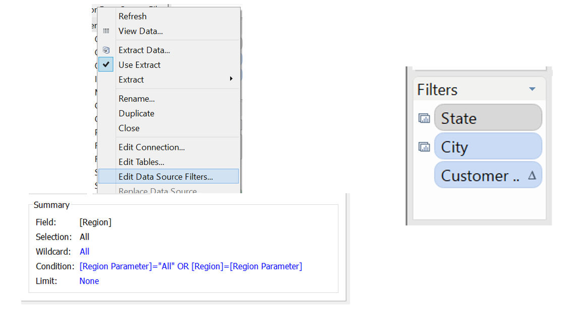
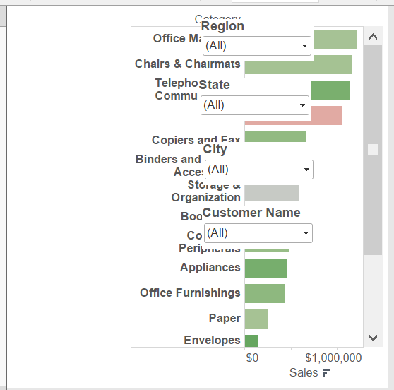
Float the filters
The next step is to add the worksheet to a dashboard, with a blank object where the filters will go. Add as many vertical containers, floating, as you have filters, and move each filter inside a different container. You should end up with something like the following:
Create a “Fake” worksheet(s)
This worksheet is the driver behind the idea. It can be created in a number of ways, but you want to end up with a blank looking worksheet.
I created mine by using a calculated field of AVG(1) and then adding that to both rows and columns. Since we want this worksheet to fill height, adding a continuous field to the rows shelf means that fill height is the default behaviour. Next you need to change everything the colour of the dashboard background (white in my case) and hide all chart artefacts such as axis lines etc. This should give you a completely blank looking worksheet.
You need one fake for each filter that is not the top level i.e. in my case I have 4 filters, so I needed 3 fake worksheets.
The next bit is a little tricky – you need to add filters to these fake worksheets so that they show data only if the level above contains one distinct record. This will involve applying the quick filters to multiple worksheets, as well as a test for distinctness.
I chose to use both tests for the parameter contents and COUNTD (count distinct) formulae, though until Tableau 8.2 is released you will need to use an extract if you are using COUNTD against an excel/text/csv file. The table below shows you my configuration:
| Fake Sheet ID | Selection Filters | Additional Filter |
| Fake 1 | Region (As data source filter) | Region Parameter <> “All” |
| Fake 2 | Region (As data source filter)State Filter | COUNTD([State])<>1 |
| Fake 3 | Region (As data source filter)State FilterCity Filter | COUNTD([City])<>1 |
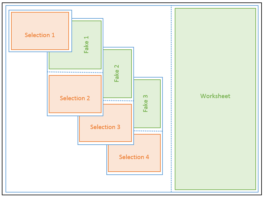
Add “Fake” worksheets to the view and configure
Finally, the worksheets are added to the containers. I’ve added a diagram below to help out, but please have a look at my workbook for the exact widths/heights/x/y used.
Rules:
- Blank space next to the main worksheet is the width of the filters
- Floating containers have fixed height/width/x/y (being floating they have to have set values by nature, but you want to make sure they are the specific ones you need)
- Quick Filters / Parameters have fixed height
- Fake worksheets do not have fixed height
Diagram Legend:
- Black = Dashboard
- Blue = Container, dotted line indicates horizontal / vertical
- Orange = Quick Filter / Parameter]
- Green = Worksheet
Finished workbook
Below is the finished thing. Selecting one option from a filter makes the lower level appear.
Restrictions / Request for help
After having a play you may have noticed the restrictions on the view.
It only works 100% if you use the filters in order. Try to skip a level on the roll back and you can end up with an orphaned filter. This is due to the lower filters still applying, and I haven’t managed to overcome it. So if you come up with a solution, I’d be very happy to hear it!
And Finally
There you go. I know the implementation is not the latest/selected month that I mentioned at the beginning, but I wanted to show the principals rather than a specific single use-case. You can make whatever you like ‘pop’ – an image, a sparkline – whatever you like, so go nuts!
Is this technique vital in creating a dashboard? Well, no, but like many things you can do in Tableau when you spend a bit more time on a dashboard, I think it looks cool and is worth the extra effort!
