Cascading Quick Filters in Tableau

Cascading Quick Filters in Tableau

Overview

This blog post is going to cover both the basics of quick filters as well as trying to push the boundaries, so if you know the basics, feel free to skip down to the later examples!

Quick Filters refresh

Before I get into the ins-and-outs of cascading quick filters, I should probably put a quick explanation of what a “Quick Filter” is. What Tableau defines as a Quick Filter is just a specific visual object for allowing easy alteration of filters on the visualisation. The visual appearance can be altered if desired, and the quick filter can be surfaced on a dashboard to allow an end user to dynamically alter the filter, making a single dashboard the equivalent of many static ones.

“Cascading” filters?

cascading-wtarfallCascading (or hierarchical) filters are ones where the selection on the first filter causes the second to be limited to only those values that are now relevant. This sort of set-up is vital in preventing a situation where the user has selected to see all data for the 30th day of the month of February, for instance. It creates a better experience for the user, so let’s go over the basics of how it’s done, then try to push it as far as we can!

Note, I will not be discussing the effect of quick filters on performance in this post

[EDIT: As pointed out by Jonathan Drummey in the comments, whilst I am not discussing performance, it is important to note that many Quick Filters can seriously damage the performance of a dashboard, so proceed with caution!]


Linking 2 quick filters in Tableau

Add the filters to the view

Quick filters are added to a view by right-clicking on a field and selecting “Show Quick Filter”. Note that the field doesn’t have to be in use in the view at the time.

image

Do this for a couple of fields – in the example workbook at the end of this post I’ve used “Zone”, a calculated field that separates the regions into 3 zones, and Region.

Link the filters

Looking at the properties of the quick filter for Zone, we can see that we can two options: “All values in Database” or “Only Relevant Values”.

image

All Values in Database is exactly what it sounds like – this will fill the quick filter list with all values for that field within the datasource.

Only Relevant Values is a little more subtle. This means the quick filter list will show all the values that are left after applying the other filters, if those filters are on the same or a higher level in the hierarchy.

This means that if the Zone quick filter is set to All Values in Database and the Region quick filter is set to Only Relevant Values, we get a cascade of 2.

imageimage

imageimage

The power of 3

To add a 3rd quick filter requires introducing the concept of “Context”. I don’t have the space here to go into how it works, but in essence it is a primary filter layer.

A field can be added to context if the field is already on the Filters shelf.

image

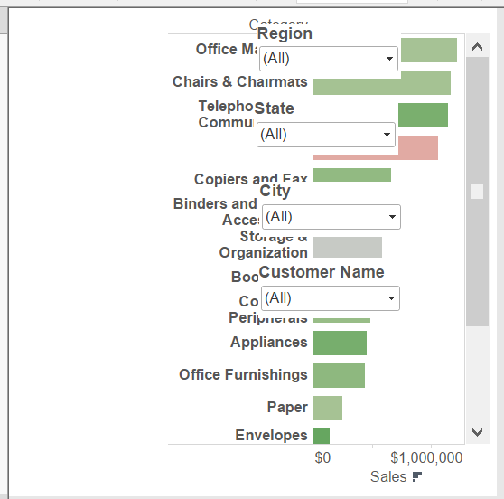
Adding the 3rd quick filter (in my example, State) to the view requires adding the top level,“Zone”, to context. Then Region is altered to “All Values in context” (whatever the “Context” set of filters lets through), and State is set to Relevant.

imageimage

imageimage

imageimage

Context Filters, party of 4?

3 is good, but let’s keep going with number 4. For this one, we need to take note of something about the “Only Relevant Values” setting. As mentioned before, it applies a filter based on the same or a higher level in the hierarchy. As Context works as another master level, we can add a field to context, and have its Quick Filter set to Only Relevant to add a sub-level within the context.

In my example, I have added City as a quick filter, with both Zone and Region added to Context.

imageimage

imageimage

imageimage

imageimage

The 5th Element

Obviously, since we have got this far, we have to try to go further. Unfortunately, there are no more options in terms of sub-layers within Context, and no other settings on the quick filters, so that would appear to be it.

Except…

there is a way round this problem based on the order that Tableau calculates filters.

Context filters are first, then dimensions, then measures, and then table calculations.

As we have filled up context and standard dimensions, we could look at measures. However, that allows filtering on a range of aggregated values, which is not normally what is required for cascading filters, so I have discounted this step.

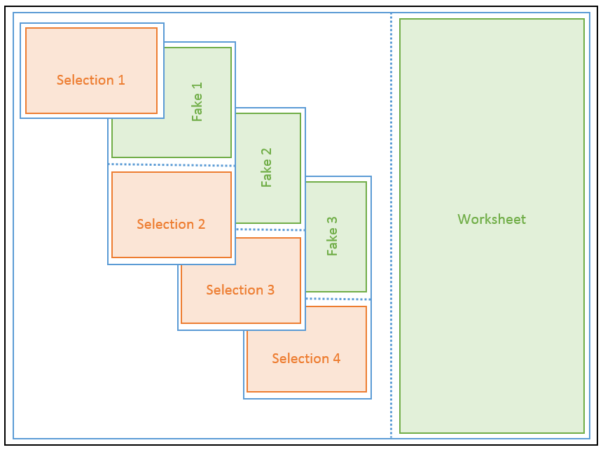
That leaves table calculations!

To turn a dimension into a table calculation we need to use the LOOKUP trick.

image

Adding this to the view gives us what is effectively an “Only Relative” quick filter, and so the 5th filter.

[EDIT: Number 6 added with help from Jonathan Drummey]

Number 6 – let’s go back to the Source

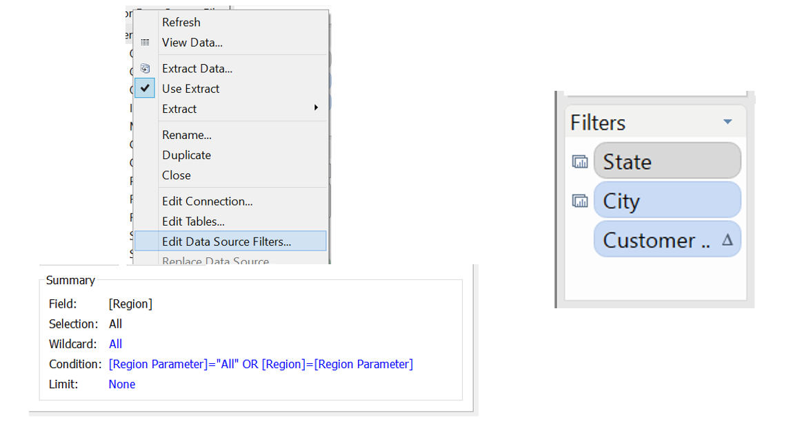
As mentioned by Jonathan in the comments, there is a way of adding filter number six, as long as you are rocking version 8 of Tableau. (really, why wouldn’t you be?!) – Data Source Filters.

Now, I know what you are thinking – you can’t use one of these as a quick filter. And you’d be right, but that’s not stopped us so far, so let’s see what we can do with this.

The aim is to present a selection option for the end user, without using a quick filter, and so we turn to parameters. Parameters can be surfaced to the end user, but don’t do anything in an of themselves – we need to combine them with a calculated field.

For my parameter I created a list of 2 Territory Managers, and then used a calculated field to check whether the Zone is valid for the selected Manager.

image

image

This is then added as a data source filter (note that in the Tableau Public version of this file, there are two data sources, as I only wanted this filter to apply to one view – same setup as the old-school Global Filter)

image

image

Choose to “Show Parameter Control” and filter(ish) is now complete.

A couple of last things regarding datasource filters:

1) Terminology. As we now have a data source filter in place, the previous setting of “All values in Database” technically becomes “All values after datasource filter”

2) Is this a true equivalent of a quick filter? Well, no – not quite. Currently there is no way to make the parameter values update automatically, so this is a fixed list. However, as this is the top-most filter, that’s ok.

[/EDIT]

But what if I want more?

Can we go further? Not really, no. To get more levels, you have two options, use a measure (already discounted), or put a dimension on the Pages shelf.

The pages shelf has potential, but is much more specific in the set-up you need. The layout is calculated before this step, so axes won’t change size, and headers won’t be hidden if the specific page has no data. The upshot of this is that using the Pages shelf in this way would likely cause more problems than it solves.


And there you have it. I’ve included a summary table and an example workbook below, so let me know if you found this useful, or if has only sparked more questions!

Popping Parameters

Difficulty Level: Jedi
Time to implement: 30-60 minutes

First off, an admission – this blog is about both parameters and quick filters, but I love the alliteration in “Popping Parameters”, so that’s the name that stuck!

Recently I’ve had a number of requests from clients wanting to be able to show a monthly report with either the latest month or a month of their choosing. My solution was to utilise a parameter / filter combination in a similar manner to http://vizwiz.blogspot.nl/2014/01/tableau-tip-showing-all-dates-on-date.html (not the only example, I’m sure).

This worked, and the client was happy.

However, I was not.

Sure, the solution worked, but the quick filter bothered me. If the parameter was set to “selected month”, then showing the quick filter was what you would expect. But when I chose “latest month”, then the quick filter was not just pointless, it was downright misleading – changing the filter did nothing, meant nothing. I thus wanted it just go away. However, whilst you can determine whether the values in one filter should be dependent on another (relevant values), you can’t dynamically add/remove the quick filter from the dashboard.

As you can probably guess by the fact that I’ve written this post, I decided to approach the situation from another angle and managed to create a solution.

I’ll go over the steps needed to create the view, but please feel free to skip to the end to see the solution in action before reading on.

Create the filters

First step is to create the filters or parameters you want to use, and add them to a worksheet.
In my version, I used the following:


Object Where Rules
Region (Dimension)Region Parameter (Parameter) Data Source Filter [Region Parameter]=”All” OR [Region]=[Region Parameter]
State (Dimension) Context Filter “All in data source”
City (Dimension)  Filter “All in context”
Customer Name (Table Calculation)  Filter  As this is a table calculation, it operates after other filters without being explicitly set

Note that you don’t necessarily need to use the same set up I have, as long as you can make the fields cascade (see my previous blog on this topic for more information).Popping - Filters

Float the filters

The next step is to add the worksheet to a dashboard, with a blank object where the filters will go. Add as many vertical containers, floating, as you have filters, and move each filter inside a different container. You should end up with something like the following:

Popping - Floating

Create a “Fake” worksheet(s)

This worksheet is the driver behind the idea. It can be created in a number of ways, but you want to end up with a blank looking worksheet.

I created mine by using a calculated field of AVG(1) and then adding that to both rows and columns. Since we want this worksheet to fill height, adding a continuous field to the rows shelf means that fill height is the default behaviour. Next you need to change everything the colour of the dashboard background (white in my case) and hide all chart artefacts such as axis lines etc. This should give you a completely blank looking worksheet.

You need one fake for each filter that is not the top level i.e. in my case I have 4 filters, so I needed 3 fake worksheets.
The next bit is a little tricky – you need to add filters to these fake worksheets so that they show data only if the level above contains one distinct record. This will involve applying the quick filters to multiple worksheets, as well as a test for distinctness.

I chose to use both tests for the parameter contents and COUNTD (count distinct) formulae, though until Tableau 8.2 is released you will need to use an extract if you are using COUNTD against an excel/text/csv file. The table below shows you my configuration:

Fake Sheet ID Selection Filters Additional Filter
Fake 1 Region (As data source filter) Region Parameter <> “All”
Fake 2 Region (As data source filter)State Filter COUNTD([State])<>1
Fake 3  Region (As data source filter)State FilterCity Filter COUNTD([City])<>1

Add “Fake” worksheets to the view and configure

Finally, the worksheets are added to the containers. I’ve added a diagram below to help out, but please have a look at my workbook for the exact widths/heights/x/y used.

Rules:

  • Blank space next to the main worksheet is the width of the filters
  • Floating containers have fixed height/width/x/y (being floating they have to have set values by nature, but you want to make sure they are the specific ones you need)
  • Quick Filters / Parameters have fixed height
  • Fake worksheets do not have fixed height

Diagram Legend:

  • Black = Dashboard
  • Blue = Container, dotted line indicates horizontal / vertical
  • Orange = Quick Filter / Parameter]
  • Green = Worksheet

Popping - Diagram

Finished workbook

Below is the finished thing. Selecting one option from a filter makes the lower level appear.


Restrictions / Request for help

After having a play you may have noticed the restrictions on the view.
It only works 100% if you use the filters in order. Try to skip a level on the roll back and you can end up with an orphaned filter. This is due to the lower filters still applying, and I haven’t managed to overcome it. So if you come up with a solution, I’d be very happy to hear it!

And Finally

There you go. I know the implementation is not the latest/selected month that I mentioned at the beginning, but I wanted to show the principals rather than a specific single use-case. You can make whatever you like ‘pop’ – an image, a sparkline – whatever you like, so go nuts!

Is this technique vital in creating a dashboard? Well, no, but like many things you can do in Tableau when you spend a bit more time on a dashboard, I think it looks cool and is worth the extra effort!

Radar Charts in Tableau

Radar Charts in Tableau – part 1

Tableau is a very powerful tool, but there are some things that it either doesn’t do, or is very difficult to do. Sometimes, the skill is knowing the difference – is something just plain hard, or is it impossible?

Personally, I like a challenge. So when a client asked me if it was possible to create a Spider Diagrams (one of the many alternative names for a Radar Chart) in Tableau, responding with “no” just didn’t sit right with me. Not natively, perhaps, but it must be possible..

The aim

What is a Radar Chart? A radar chart shows data in a cyclic manner, overlaid on a spoke-and-web design (hence the ‘Spider’)

These are fairly easy in something like Excel, but are not part of the standard chart types in Tableau.

The method

My first approach was to use a background image. If you haven’t created a chart with a custom background image before, they are fairly simple – you just need to know the bounds on an X-Y scatter plot that the image should be within. As I was styling mine on excel, I did a screengrab of an empty excel version, and so had my background.

Spider Diagram Background

For the data, I just created some basic fake information in an excel file. 5 lines of data to create 5 points.

image

The X and Y coordinates took a little bit of math, after first finding the X-Y coordinates of the end points on the background image, assuming the centre is (0,0).

image


That was added to the datasource, and then I used Tableau to generate where the relative point would be based on the value of the point as compared to the maximum value on the chart.

image

Put the Relative X field on Columns, the Relative Y field on Rows, use Line type with the ID of the point as the Path, colour it by the name of the line and there we go.

image

Almost.

As it’s a cyclic plot, the first and last points are supposed to join up. This works with a polygon, but not with a line chart. Back to the excel, add another data point, same as the first, back to Tableau, refresh and there we go – it works.

image

To finish off the view, I first added a no-change “Lookup” table calculation, to allow just showing one of the two lines, without changing the max number, and so the positions.

image

Next thing to do was to add the label. This was made more complicated by the fact that the Tableau v8 layout engine doesn’t overlay labels for two points if they are the same value. This means the start/end point looks a bit odd so we need to use a calculated field to only include the value if it is not the last point on the line

IF LAST()<>0 THEN SUM(Value) END

image

Put SUM(Result) onto size if you want, but there we have it. A radar chart in Tableau.

Next Time

We may have now done something in Tableau that would have a good number of people recoiling in horror, but I’m not convinced we should stop here. I will be adding a second post on this topic, where we will try to go that little bit further.

For now though, I will leave you with the workbook so far.